 |
| Slot Mask staggered grid |
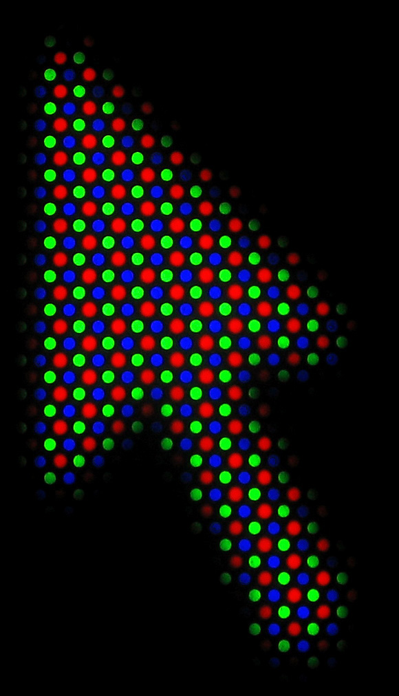
slot masks - also known by the brand name "Cromaclear" and/or "in-line shadow mask". These are probably the mask you're most familiar with, as they were used on most consumer televisions. They are characterized by the familiar staggered grid of red, green and blue phosphors.
 |
| Aperture Grille wires |
 |
| Shadow Mask Triad |
When we attempt to reproduce these masks on modern displays, the simplest solution is to take an image of the phosphor layout, shrink it down and tile it across the image, then combine the game image with the phosphor image in some way (multiplication or screen combine are common). This is a simple and straightforward strategy that works well at very high resolutions, but it can become a real mess at lower resolutions as a result of the physical display's subpixel structure (see the pink and green patterns in CRT-Royale's mask at 1080p).
 |
| CRT-Royale's tiled images of phosphor layouts at 1080p |
Just like a CRT, LCD monitors display colors by shining light through tiny lenses at various intensities and they combine to form the colors you see. These phosphors are usually much smaller than what you find on a CRT TV, but very fine details can still be distorted by these structures. Very small text is probably the place where we encounter these limitations most often and, back in the late 1990s, companies started trying to improve the situation using subpixel-based rendering techniques under the names ClearType, FreeType, etc. These techniques work with the LCD subpixel structure to give the illusion of higher resolution than the monitor is actually capable of displaying cleanly.
We can use some of these same tricks in our CRT reproduction shaders to produce better mask effects at lower resolutions, without the chromatic aberration caused by averaging together colors at the subpixel level. These patterns rely on the physical pixel structure of the display monitor, so they need to be tiled using gl_FragCoord (or texCoord.st * OutputSize.xy) so the tiling always matches up.
 |
| cgwg's crt-geom subpx aperture grille |
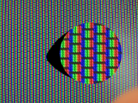
At 1080p, this looks analogous to a low-TVL Trinitron TV (shader on the left, PVM on the right):
 |
| PVM shot from here, perspective-corrected in GIMP |
Here's a detail comparing the subpixel-respecting strategy with a naive tiling approach at 1080p:
At 1080p, the TVL of the simulated display is unrealistically low (like, maybe a really crummy portable TV or something), but at 4K this mask gets more realistic in terms of scale.
At 8K, though, you can start drawing much better, more accurate phoshor patterns while still maintaining a realistically usable TVL, though the tiled patterns start getting pretty weird.
| Funky slot mask pattern |
 The results look good, but it's worth noting that at these resolutions, naive tiling doesn't look too shabby, either, especially with a few feet of distance between the viewer and the monitor.
 |
| crt-lottes rotated mask |
Many subpixel-respecting mask patterns can be found in LUT form alongside cgwg's crt-geom-deluxe shader, including some of these and some others I didn't mention (mostly aperture grille variations that work at higher resolutions, like 4K and 8K. You can also find these and others in my subpixel_masks shader snippet, which is designed to be #include-d in other shaders for easy mask-generation and uses an expensive but very informative array-based syntax so the patterns are easier to visualize and understand.


Hey Hunter, great post! Nesguy here. Very nice summary. It seems like CRT masks are one of those things that's waiting for better technology in order to truly shine. What you really want for CRT masks is a super-bright emissive display with retina resolution. Maybe quantum dot displays in 10 years? Anyway, keep up the good work!
ReplyDelete@Patrick
ReplyDeleteThanks man :)
I know nothing in there is news to you, but I figured it'd be good to get all that stuff down on paper somewhere, since cgwg clearly was on top of it with his LUTs but I couldn't find much/any info on it online.
And yeah, maybe the tech will catch up in the next decade :P
Hey, I know this is slightly unrelated to the post above, but I heard you're the one that helped port various shaders to BSNES. I wanted to thank you for your help with that, but there is one shader in particular I was wondering if there is any chance you could help with. I'm trying to get a 3x version of the xBRZ shader running in BSNES, but unfortunately I just don't understand the code to do it myself. Currently, there is only a 4x option for BSNES. Any chance you could port a 3x version of xBRZ for BSNES as well?
ReplyDelete@MiniSiets
ReplyDeleteHey, glad you're enjoying them. For xBRZ, I would recommend using the xBRZ-Freescale shader, which doesn't have a specific scale factor of its own:
https://github.com/hizzlekizzle/quark-shaders/tree/master/xBRZ-Freescale.shader
@Hunter K.
ReplyDeleteOh, I think that's the one BSNES already uses. I was under the impression that it was a 4x shader given that it renders at a similar intensity of effect. That would explain why I couldn't find a simple variable to control the scaling in the code! Yeah, it works great for certain games like Yoshi's Island in particular, but sometimes the smoothing effect can be so powerful that it kind of warps the look and changes the feel of the original game's aesthetic, like Super Metroid for example is more of a darker sci-fi experience, but the filter makes it look too "cartoony" by over-smoothing the pixels. It's just a little too powerful at what it does. That's why I'm trying to find a fixed 3x solution because I've found it just works the best all around for most games. Do you know of a way to get that running in BSNES, or would that require some extensive work?
Thanks for your time, Hunter.
You can make it work at any scale you like. You just need to add explicit height and width values to the second pass in the manifest, like this:
ReplyDeleteprogram
height: 300%
width: 300%
filter: nearest
fragment: xBRZ-Freescale-p1.fs
Hmm, not sure if I'm just doing it wrong, but it still doesn't look quite like what I'm going for. Adding the height and width lines did seem to change it, but only to little effect. I'm trying to replicate the look of the 3x filter as it is implemented in similar emulators like SNES9X and VBAM-M, but unfortunately my lack of understanding in how the code works make it difficult for me to do. I'll have to keep looking for other solutions. Don't want to derail your comment section with my off-topic issues lol.
ReplyDeleteA bit late, but I've been tinkering with a mask more targeted at 4K but based on using the sub-pixel stuff better, and a slight tweak to the 'green/purple' approach made a big visual quality jump when I've been testing it:
ReplyDeleteGMGM
_BGR
GMGM
GR_B
R = Red, G = Green, B = Blue, M = Magenta, _ = Black.
Ends up emulating the alternating-column shadowmask extremely closely, albeit in BGR instead of RGB fashion. I think the 'naive' GM stripes w/ black bars ends up looking slightly off because it breaks down to GRB blocks so it's almost always 'left heavy' because the G subpixels end up along one edge of the black horizontal spots instead of centered on them.
@WolfWings
ReplyDeleteVery interesting! The triads are taller than they are wide, which didn't look quite right to me at first, but it looks 100% perfect for simulating TATE mode! https://i.imgur.com/cxLQCiy.png
I'll get this added to my big mask function ASAP. Thanks for sharing it!
Oh I had not actually considered using it for TATE scanlines, excellent idea! Yeah that looks extremely nice in that situation, good find!
ReplyDeleteWould there be any issues or noticable differences with a BGR subpixel monitor in emulators, gaming, and shaders like this?
ReplyDeleteOh, yeah, definitely. Anything that relies on subpixel structure is going to be a bit wonky with BGR subpixels. Text rendering usually has options to change the expected behavior, and my big mask function includes some masks that are designed for BGR, as well.
ReplyDeleteThanks, doctor!
ReplyDeleteSo to my mind, trying to emulate the shadow mask of another display and display that as an image is a mistake. Your LCD has a natural "shadow mask" built right in, in the form of the sub-pixel structure of the liquid crystals themselves.
ReplyDeleteIf you were to consider the LCD itself as a phosphor screen, and illuminate it in the shader with a virtual "electron beam", then I think you would get something much better. It won't be an exact match for any real CRT, but then it isn't exact anyway due to the differences in color and response time. As you say, work with the pixels instead of against them. Often these fake scanlines and shadow masks add a lot of unnecessary moire, distortion and darkness to the image. With the "virtual beam" approach, the natural characteristics of the display would be fully utilized.
I hope you understand what I'm getting at.
Thanks for the writeup, very helpful!
ReplyDeleteI notice in your subpixel_masks header, the shadow mask one says
2x2 shadow mask for RGB panels; good for 1080p, too small for 4K+
Was just struggling with this same issue on my smallish 4k display. For a shadow mask layout, 2x2 pixel phosphors are too small, while 4x4 ones are too big. So I came up with an approximately 3x3 phosphor layout, which is simply 4x3 display "phosphors". This one fits my RGB display nicely:
G C B B B R R R Y G
G C B B B R R R Y G
G C B B B R R R Y G
R R R Y G G C B B B
R R R Y G G C B B B
R R R Y G G C B B B
R = red, G = green, B = blue, C = cyan, Y = yellow
As a bonus, the brightness loss is marginally better than most layouts, with 2/5 of display "phosphors" used. I suppose the virtual phosphors could be made to approximate circles for more authenticity, at the cost of more brightness loss.
@Louis
ReplyDeleteOh nice, good call. I added it to the repo. Thanks for sharing! :)